Energy Distribution Diagrams
An energy distribution diagram shows the relative energies of particles in a substance. The x-axis represents kinetic energy and the y-axis is the percentage of particles with that kinetic energy. The height of the curve at any one location is the percentage of particles with that kinetic energy.
Here is a sample energy distribution diagram for two temperatures, superimposed. The black line is the lower temperature.
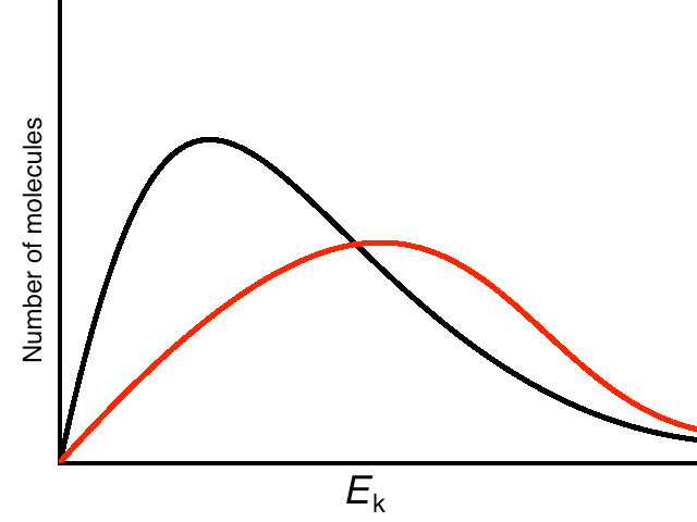
Note that, for any activation energy, the number of particles above the activation energy for the higher temperature is higher than the number of particles above the activation energy for the lower temperature. (i.e. the area to the right of any vertical line is greater under the red diagram than the black diagram)